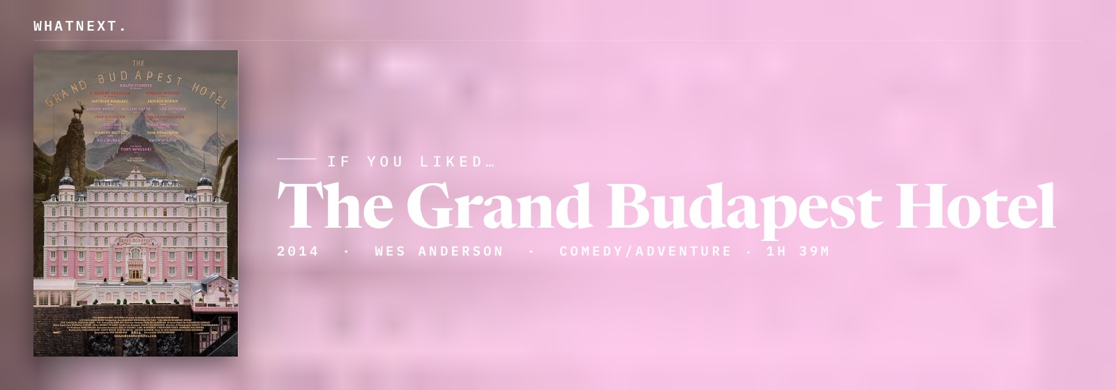
WhatNext.'s TikTok account posts short "if you liked X" videos, each one a small recommendation set built around a single seed film. For each of these posts I run a small process for turning one seed film into a short recommendation set: run a similarity query against the app's own recommendation engine, get back a ranked pool of candidates, quality-score each one, pick the best four. On August 18 I ran that process for The Grand Budapest Hotel, and about half a day after the post went out, I found a mistake in it that I'd made myself, in plain sight, in a doc I'd written the rules for.
The Pool
The query behind that post was a similarity search against The Grand Budapest Hotel, filtered down to titles that share its comedy tag. It came back with 15 candidates, each carrying two separate numbers: a similarity score, how closely it matches the seed film, and a quality score built from critic and audience review data. The similarity scores landed in a tight band, 0.80 to 0.86 across the whole pool, so every candidate was already a legitimate match; nobody in this pool was a stretch. The quality scores spread out far wider, 40 to 92, and that's the number that actually separated the field. Two titles sat well clear of the rest on quality: Matilda, at 92, the single highest score in the entire pool, and Mighty Aphrodite, at 78, fourth-highest. Matilda's similarity score, 0.80, was on the lower edge of that tight band, but still inside it, not an outlier.
Neither made the final four.
The Theme I Chose Instead
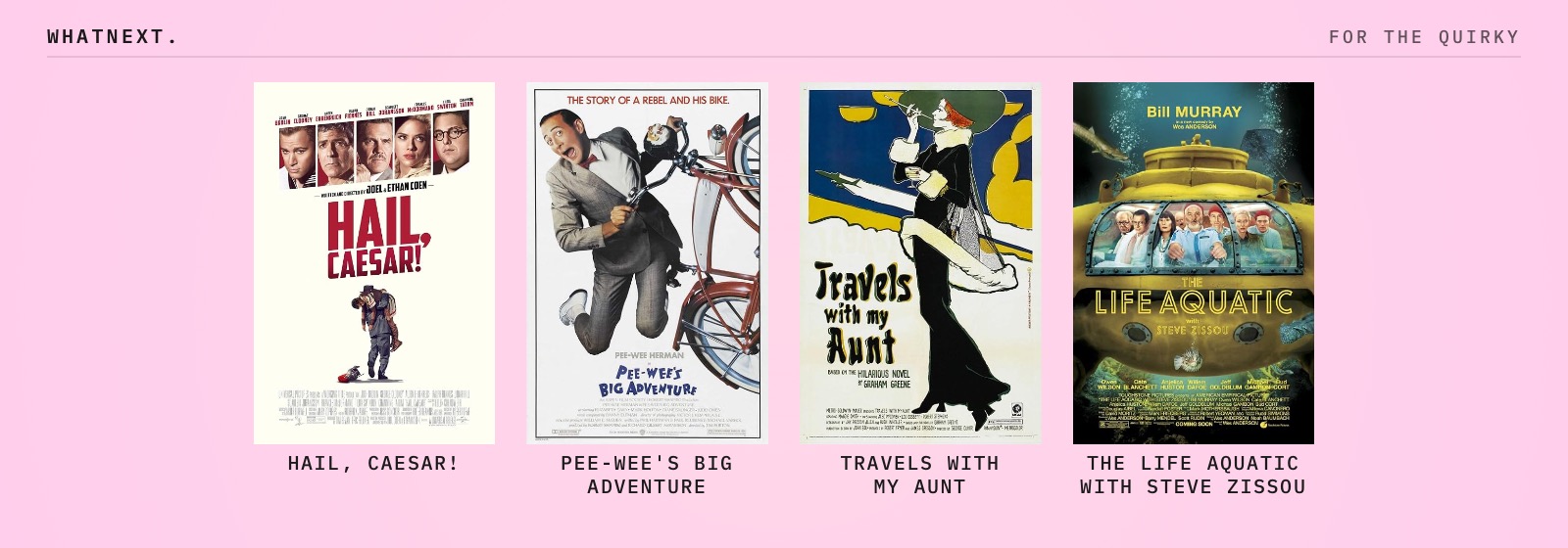
The post's format takes four picks, and nothing about it requires those four to share a sub-theme at all. I chose to want one anyway: I decided all four should hang together around a "caper," road-trip feel, the way The Grand Budapest Hotel itself is one long escape-and-chase across a fictional European country. That link was mine to draw or drop, not something the seed film or the process handed me. Matilda is a great film, but it reads as a family fantasy, not a caper. Mighty Aphrodite is an urban love story. Neither fit the shape I'd invented for the post.
So I swapped them out. Travels with My Aunt, scored 50, and The Life Aquatic with Steve Zissou, scored 57, both carry an explicit road-trip or adventure tag, and both slotted cleanly into the theme. Along with Hail, Caesar! (86) and Pee-wee's Big Adventure (87), which needed no swapping at all, that gave me four picks that all felt like they belonged in the same sentence.
It also meant trading a 92 quality score for a 50, and a 78 for a 57, to buy that sentence. The match to the seed barely moved: Matilda's 0.80 similarity sat within four points of every pick that replaced it. This wasn't a trade toward more relevant picks. It was a trade toward better-fitting ones, at a real cost in general quality.
Caught the Same Day
I didn't catch this by re-checking my own work. A separate review of the account's recent posting pattern, looking for something else entirely, flagged the Grand Budapest Hotel post as the least recognizable post the account had shipped in weeks. That sent me back to the original candidate pool to see why, and the two scores sitting at the top, both unused, were right there.
The harder question came after: why should a theme I made up myself, after the fact, ever get to outrank a candidate's actual score? The post-build process locks the four picks well before any theme, caption, or last-slide copy gets written. The theme doesn't exist yet at the moment the picks get chosen, and it never has to exist at all, it's an arbitrary link I choose to draw between titles that are already in the pool for other reasons. There was never a real reason for a not-yet-written, optional theme to reach backward and bump a higher-scored, more recognizable title out of a post in favor of a lower-scored one that merely matched it better.
Score First, Sub-Theme Second
The fix went into the account's curation rules as a real, checkable default: within a tag-filtered candidate pool, the top-scoring titles fill the available picks. A lower-scored title only gets to replace a higher-scored one for a hard disqualifier, franchise overlap, a title used too recently, an embargoed release, something concrete, not a softer "this one fits the vibe better" call. Theme, caption, and closing-line copy get written to match whichever picks scored highest, not the other way around.
A 20-plus point gap between a skipped and a chosen title, going forward, reads as a curation mistake worth catching before a post ships, not a stylistic judgment call to defend.
Why This Was Two Mistakes Stacked, Not One
The quality score and a title's real-world recognizability aren't the same measurement, one comes from review data, the other from how many people already know the film, but on this pool they moved together: Matilda is both the best-reviewed title in the set and one of the most widely known family films of the last thirty years. Swapping it out cost the post on both counts at once.
That second count is the one with the clearest evidence behind it. A controlled comparison run earlier on this account, same short-video format, same slide structure, posted days apart, pitted a globally known live-action release against an obscure one nobody outside a small festival circuit would recognize. The known title pulled in roughly two and a half times the views and twelve times the likes. That gap held even though the obscure title was posted on the account's more positive branch, so it isn't a sentiment effect. It's recognition, plain and simple, and it's the single best-confirmed performance lever this account has found so far.
Weighed against that, a shared "caper" feel across four picks in a grid nobody sees compared side by side against alternatives isn't nothing, but it isn't close to worth what it cost here.
What I'm Taking From This
The mistake itself is small, four picks on one post, a rule that fits in a paragraph. What I actually want to hold onto is the shape of it: I had already built the evidence that recognizability drives outcomes, I had already built a process that locks picks before theme copy exists, and I still let a not-yet-written theme quietly outrank a candidate's own numbers, because coherence felt like the more careful choice in the moment. It wasn't. The numbers were the more careful choice, and by default, that's the order I'm curating in from here.